Labels
Cosmograph allows you to display labels for points and clusters to provide context and identification for your data elements. You can control which labels are shown, their appearance, and their priority.
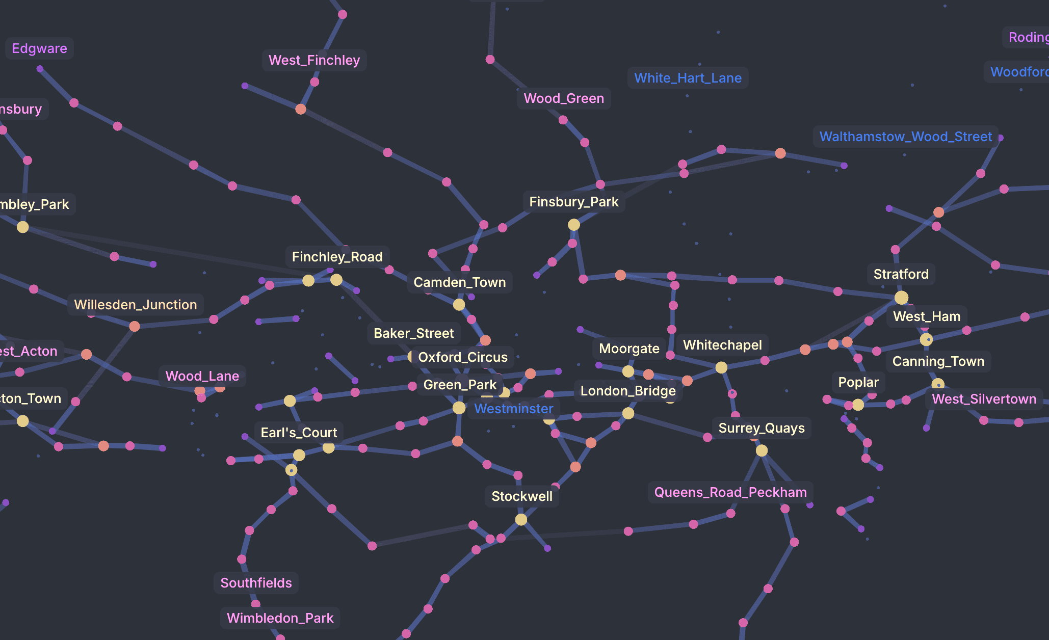
Point labels
To display labels for points, you need to specify which data column contains the label text using the pointLabelBy property.
You must also enable labels globally by setting showLabels to true.
const config = {
  // ...
  points: [
    { id: '1', name: 'Alpha', importance: 10 },
    { id: '2', name: 'Beta', importance: 5 },
    // ...
  ],
  pointLabelBy: 'name',
  showLabels: true
}Visibility control
Cosmograph provides several ways to control which labels are displayed to avoid clutter:
| Property | Description | Default |
|---|---|---|
showTopLabels | Shows labels for the most important points (determined by pointLabelWeightBy or point degree). | true |
showTopLabelsLimit | The maximum number of top labels to display. | 30 |
showDynamicLabels | Automatically shows labels for points evenly distributed across the visible area. | true |
showDynamicLabelsLimit | The maximum number of dynamic labels to display. | 30 |
showLabelsFor | An array of specific point IDs to always show labels for. | undefined |
showFocusedPointLabel | Whether to show label for the focused point. | true |
showUnselectedPointLabels | When true, shows labels for unselected points during filtering/selection. When false, hides unselected labels to allocate more visual space for selected point labels. | true |
showSelectedLabels | When true, shows labels for selected points when filtering/selection is active. When false, selected point labels are hidden. | true |
selectedPointLabelsLimit | Maximum number of labels to show for selected points when selection is active. | 100 |
Weight
You can influence which labels are prioritized using the following properties:
| Property | Description |
|---|---|
pointLabelWeightBy | A column containing numeric values. Points with higher values are more likely to have their labels displayed. |
pointLabelWeightFn | A function to transform weight values programmatically. It receives the value from pointLabelWeightBy and the point index, and should return a number between 0 and 1. |
const config = {
  // ...
  pointLabelWeightBy: 'importance',
  // normalize / clamp any data into 0..1
  pointLabelWeightFn: (value) => Math.max(0, Math.min(1, Number(value) / 100)),
}
If not provided, labels are prioritized based on:
pointSizeBy(if provided)- Point degree (total number of links)
Style
You can customize the appearance of point labels:
| Property | Description | Default |
|---|---|---|
pointLabelColor | CSS color for the labels. If not set, it matches the point color. | undefined |
pointLabelFontSize | Font size in pixels. | 13 |
pointLabelClassName | CSS class name for further styling. Can be a string or a function (text, pointIndex, pointId) => string. | undefined |
hoveredPointLabelClassName | CSS class name for the hovered point label. Can be a string or a function. | undefined |
pointLabelClassName / clusterLabelClassName can also be an inline CSS string (e.g. 'background: #333; color: white;'). If the string contains :, Cosmograph treats it as inline styles.
If you set pointLabelClassName, Cosmograph will not apply pointLabelColor automatically (it assumes you’ll handle color in CSS / inline styles)
Hovering
You can display a label when hovering over a point using showHoveredPointLabel.
const config = {
  // ...
  pointLabelBy: 'id',
  showHoveredPointLabel: true,
  hoveredPointLabelClassName: 'my-custom-tooltip' // optional
}
This label uses the same text source as defined in pointLabelBy or pointLabelFn.
Hovered labels still require pointLabelBy, but they do not require showLabels. Hovered labels are the exception: they depend on showHoveredPointLabel and do not require showLabels.
Interactivity
You can control how users interact with point labels through these props:
| Property | Args / type | Description |
|---|---|---|
onLabelClick | (index: number, id: string, event: MouseEvent) => void | Called when a point label is clicked. |
selectPointOnLabelClick | boolean | 'single' | When true, selects the clicked point and its neighbors. When 'single', selects only the clicked point. |
focusPointOnLabelClick | boolean | When true, focuses the clicked point. |
const config = {
  // ...
  selectPointOnLabelClick: true,
  onLabelClick: (index, id) => {
    console.log('Clicked label:', { index, id })
  },
}
Advanced configuration
| Property | Description | Default |
|---|---|---|
labelMargin | The margin between the label and the point in pixels. | 5 |
labelPadding | The padding inside the label in pixels. Takes an array [left, top, right, bottom]. | [6.5, 4.5, 6.5, 4.5] |
staticLabelWeight | The weight multiplier for static labels (e.g. showLabelsFor). | 0.8 |
dynamicLabelWeight | The weight multiplier for dynamic labels. | 0.7 |
Cluster labels
Cluster labels provide a high-level overview of the graph structure. To use them, you must have clustering enabled via pointClusterBy.
Enable cluster labels by setting showClusterLabels to true.
const config = {
  // ...
  pointClusterBy: 'group',
  showClusterLabels: true,
}
Cluster labels take priority over point labels to avoid clutter. When points are selected or filtered, cluster labels are hidden only if point labels are configured to be shown (for example via pointLabelBy with showTopLabels, showFocusedPointLabel, or showDynamicLabels). When cluster labels are visible, showLabelsFor labels can still appear alongside them. If no point labels are configured, cluster labels remain visible.
Style
| Property | Description | Default |
|---|---|---|
clusterLabelFontSize | Base font size for cluster labels. The final size might be adjusted based on scaleClusterLabels. | 16 |
scaleClusterLabels | Scales label size based on the number of points in the cluster. | true |
usePointColorStrategyForClusterLabels | Colors the label using the point color strategy. | false |
clusterLabelClassName | CSS class for custom styling. Can be a string or a function (text, clusterIndex) => string. | Default style |
Interactivity
You can control how users interact with cluster labels through these props:
| Property | Args / type | Description |
|---|---|---|
onClusterLabelClick | (clusterIndex: number, clusterId: string, event: MouseEvent) => void | Called when a cluster label is clicked. |
selectClusterOnLabelClick | boolean | When true, selects all points in the clicked cluster. |
const config = {
  // ...
  selectClusterOnLabelClick: true,
  onClusterLabelClick: (clusterIndex, clusterId) => {
    console.log('Clicked cluster label:', { clusterIndex, clusterId })
  },
}
Custom labels
You can manually add labels to the graph using the customLabels property. This is useful for annotations or highlighting specific areas unrelated to data points.
const config = {
  // ...
  customLabels: [
    { text: 'My Label', position: [100, 200] },
    { text: 'Important Area', position: [500, 300], className: 'myCustomLabel' }
  ]
}
The customLabels property expects an array of objects with the following properties:
| Property | Type | Description |
|---|---|---|
text | string | The text content of the label. |
position | [number, number] | The [x, y] coordinates of the label. |
color | string | Optional. The text color of the label. If not set, uses pointLabelColor. |
className | string | Optional. A custom CSS class for the label. Defaults to cosmographCustomLabel. |
weight | number | Optional. The priority weight of the label. Defaults to staticLabelWeight. |
fontSize | number | Optional. The font size of the label. |
padding | { left: number; top: number; right: number; bottom: number } | Optional. Padding around the label. |
Custom labels use the same CSS class as point labels by default. You can override this using the className property.